Text Components
Textnode
Text
Text with bold

Text with other decorations

Decoration wrapper

Text Styles
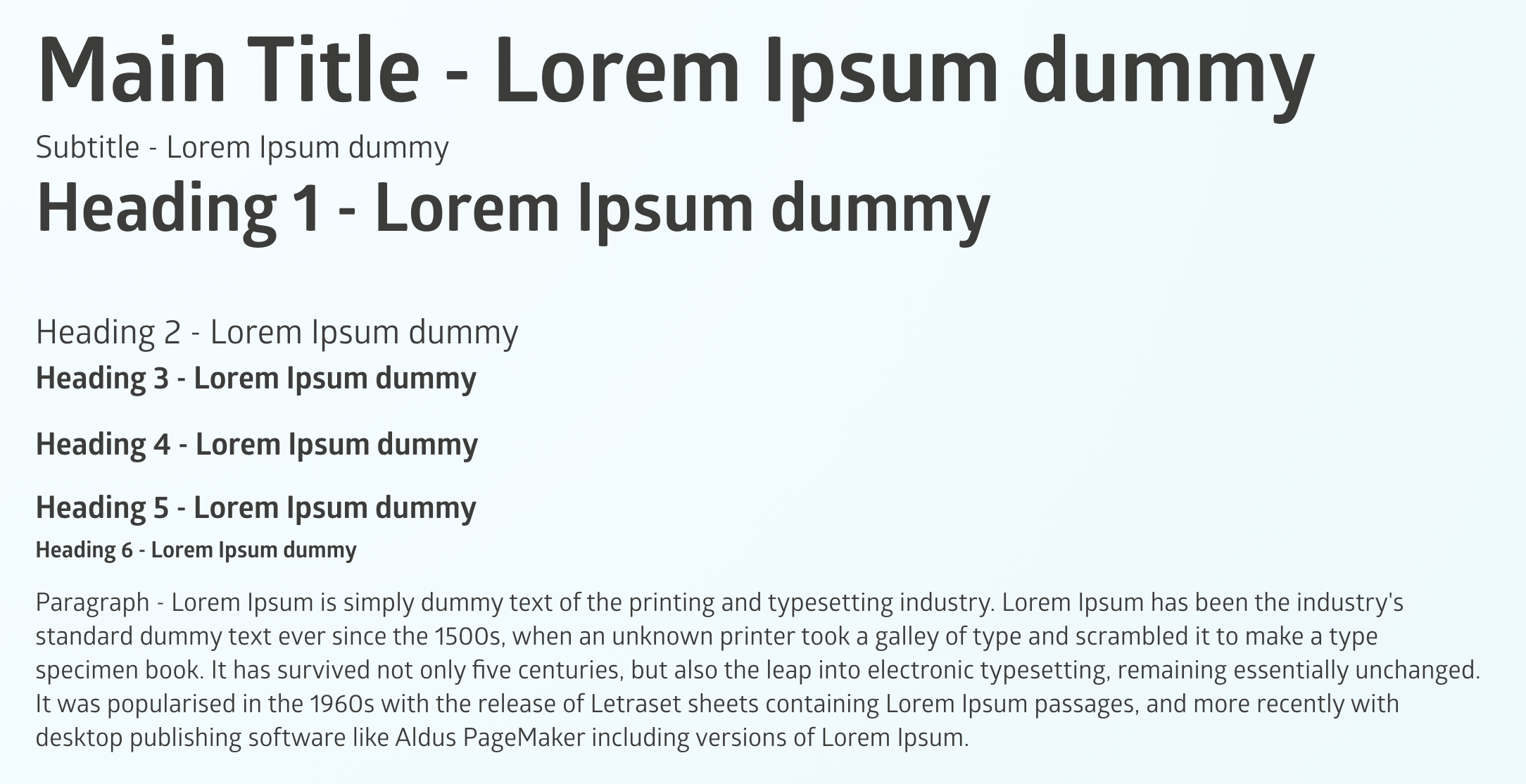
Text styles are text components that have a specific HTML tag used to determine the different styles available in a lesson.
Positive Action is currently providing the following text styles:
- Main Title
- Subtitle
- Heading 1, Heading 2, Heading 3, Heading 4, Heading 5, Heading 6
- Paragraph
As you'll have already experienced in your work with text components, the structure will define a "tagName" which in this case can be h1, h2, h3, h4, h5, h6, div, span or p (paragraph) and the content will be wrapped in it.
Let's take as an example Heading 1 component structure:

- "name": "Heading1" - name attribute which can be useful as a general identifier of the element or when you want to style the element to fit the design of your platform.
- "type" : "text" - type of the element
- "classes" - if Positive Action is providing custom style that needs to be matched, it will be provided here
- "tagName" - h1 in this case as the tag of the element
- "components"
- "type":"textnode"
- "content":"Heading 1 - Lorem Ipsum dummy"
Unit Heading
Here is an example for Unit Heading where we are using Heading 5 component to define it:

The following screenshot shows a visual representation of the text styles used in the Positive Action lessons. While some of them have the same font-size, they differ by adding or removing spacing above or below the element:

Looking at the code for the sample above, we will get the following: